Choosing the right color combination can make a huge difference in the design of a small kitchen. The shades chosen not only influence the style and personality of the space, but also directly affect the visual perception of spaciousness and light. In kitchens with limited square footage, a well-thought-out color palette creates functional, welcoming, and aesthetically balanced spaces. This article explores the best color combinations to maximize the potential of small kitchens, adapting to different tastes and decorative styles.
Importance of color selection in small kitchens
The choice of colors in small kitchens plays a fundamental role in the perception of space. A carefully planned design, with an appropriate color palette, can transform a small kitchen, providing a sense of visual spaciousness and light. In the field of interior design, it has been found that light colors, such as whites, creams, and pastels, tend to reflect more light, contributing to a more open and airy atmosphere. This is especially relevant for small kitchens where limited space can make the area feel oppressive.
A study conducted by the Madrid interior design team reveals that colors not only affect how we perceive a space, but also influence our mood. For example, warm tones, such as yellows or soft blues, add a cozy feeling, while cooler colors tend to create a more relaxing atmosphere. Thus, the balanced use of color combinations in small kitchens can enhance the area’s functionality, making it a place you’ll want to spend time in.
Additionally, it’s important to consider how colors interact with natural and artificial lighting in the kitchen. Current trends suggest that a strategic use of color can enhance light, bringing elements and surfaces to life. The kitchen’s style, including cabinet finishes and accessories, should also align with the color choice, creating a cohesive design. A wise choice of color palette not only maximizes space but also facilitates the kitchen’s integration with the rest of the home, providing continuity and visual harmony. Ultimately, a conscious approach to color selection can result in small kitchens that are functional, inviting, and stylish.
Popular color palettes for small kitchens
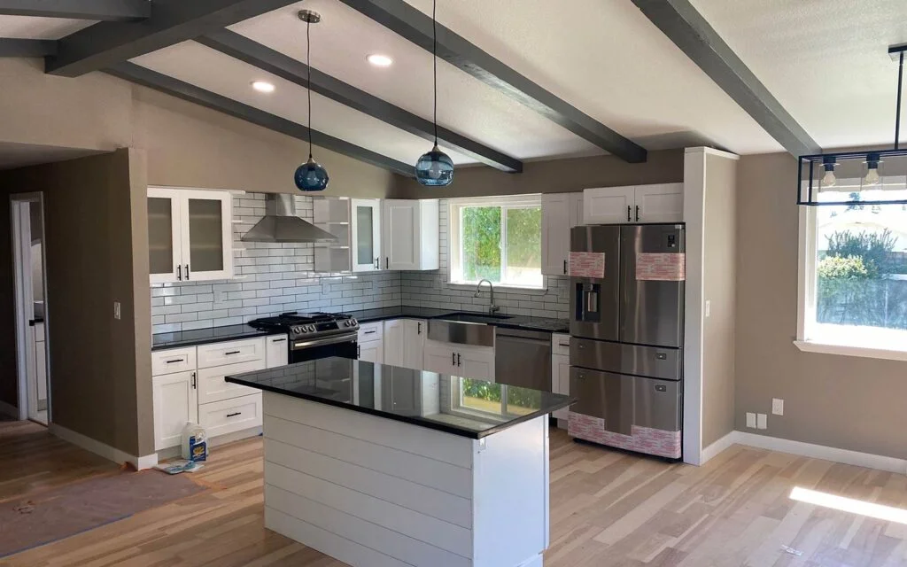
Choosing the right color palette is essential for maximizing space and functionality in small kitchens. Color combinations not only affect the appearance of the room but also influence the perception of space. A very popular choice in this context is the combination of white and gray. White provides light and spaciousness, while gray adds a modern and elegant touch. This palette allows kitchen elements, such as furniture and appliances, to blend harmoniously, creating a sense of continuity.
Another palette that has become quite popular in contemporary designs is the combination of soft blue with hints of yellow. Soft blue is known for its calming and refreshing effect, ideal for spaces where creativity and tranquility are pumped, such as a kitchen. Yellow accents, which can be found in accessories or utensils, bring energy and joy, making the space feel more welcoming and vibrant. This combination works especially well in small kitchens where a balance between serenity and functionality is sought.
Finally, mint green combined with natural wood has become a favorite choice for those seeking a more organic approach connected to nature. Mint green is not only refreshing but can also help increase the perception of a larger space. Natural wood perfectly complements this palette, providing warmth and a sense of rusticity that contrasts with the modern colors. Opting for this combination in small kitchens not only transforms the space into a welcoming place but also evokes feelings of freshness and comfort.
When selecting a color palette, it’s essential to consider the lighting and materials used, as these factors can significantly affect the final result and atmosphere of the kitchen.
Pro Tip: Looking for expert kitchen remodeling services near you in Cheshire CT? Get top-quality renovations, custom designs, and affordable solutions. Call today for a free estimate!
Colors that visually expand the space
When it comes to maximizing space in small kitchens, choosing the right colors is crucial to creating a feeling of spaciousness and lightness. Light shades, such as white, beige, and soft pastels, are especially effective at visually expanding any area. These color combinations not only reflect light better but also help small areas appear more open and airy.
It’s a good idea to start with light colors on the walls. For example, a white or beige wall can act as a neutral canvas that makes the other elements of the kitchen pop. Additionally, pastel colors, such as light blue or mint green, can add a modern and inviting touch without overwhelming the space. One option is to apply these shades to tiles, which can add texture and visual appeal without sacrificing brightness.
Cool tones, such as soft blues or lilacs, can also give the illusion of depth. When used in cabinets or shelves, these colors can create a distancing effect that makes a small kitchen feel larger. To maximize this feeling, it’s advisable to avoid stark contrasts between furniture and walls; instead, choosing color combinations that flow smoothly into each other is more effective.
Integrating these colors into accessories is also key to the overall design. Opting for utensils and decorations in light or pastel tones can maintain visual harmony in the kitchen. This completes an atmosphere that expands the perception of space, making small kitchens feel more welcoming and functional. With the right color combinations, it’s possible to transform any tiny kitchen into a space with a more spacious and attractive design.
Common mistakes when choosing colors for small kitchens
Selecting an appropriate color palette for small kitchens can be a challenge, especially in small spaces where every detail counts. One of the most common mistakes is opting for dark colors. While these shades can add a touch of elegance, in small kitchens they tend to create a claustrophobic feeling, making the space feel smaller and less inviting. Instead, it’s advisable to opt for light, neutral colors that reflect light and create a sense of spaciousness.
Another common mistake is a lack of harmony in color schemes. Choosing shades that don’t flow with the home’s overall style can result in an incoherent and unattractive design. It’s essential to consider how color combinations interact not only in the kitchen but also in the rest of the home. Selecting colors that complement the furnishings, flooring, and adjacent walls will help achieve a more cohesive and pleasing atmosphere.
Overusing patterns is another common mistake that can visually overwhelm a small space. While patterns can add decorative interest, their use in small kitchens should be moderate. For example, using a single pattern on the backsplash or curtains is a better option than filling the space with multiple competing patterns. The key is to maintain balance, using patterns on elements that add character without overwhelming the eye.
By being aware of these common mistakes, it’s easier to choose appropriate color combinations that maximize space and enhance the functionality of small kitchens. With the right selection, you can transform a small area into an attractive and practical space.